Capacity Level Column
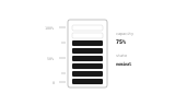
CSSA vertical instrumentation column of horizontal segments illuminates progressively from the bottom to represent dynamic system capacity and resource levels.
- Tier
- CSS
- Dependencies
- None
- Duration
- 8 s, loops
- Categories
- Data and progress
- Use cases
- Determinate progress, Dashboards and reporting
- Industries
- SaaS and software, IT services and infrastructure
- Style
- Data mark · regular stroke
- Set
- capacity
- Tags
- loopbarsprogressui
Companion assets
The same artwork, not animated. Derived from the entry’s own resting state, so it matches exactly.
Code
animation.svg
<svg xmlns="http://www.w3.org/2000/svg" aria-labelledby="capacity-level-title" class="pulsar pulsar-capacity-level" data-pulsar="capacity-level" role="img" viewBox="0 0 160 96"><title id="capacity-level-title">Vertical segmented capacity level column illuminating horizontal bars progressively from bottom to top</title><rect width="36" height="62" x="62" y="18" fill="none" stroke="currentColor" stroke-width=".8" opacity=".3" rx="2"></rect><g fill="none" stroke="currentColor" stroke-width=".6" opacity=".35"><line x1="54" x2="60" y1="25" y2="25"></line><line x1="56" x2="60" y1="39" y2="39"></line><line x1="54" x2="60" y1="53" y2="53"></line><line x1="56" x2="60" y1="67" y2="67"></line><line x1="54" x2="60" y1="75" y2="75"></line></g><g fill="currentColor" font-family="monospace" font-size="3.5" opacity=".35" text-anchor="end"><text x="50" y="27">100%</text><text x="50" y="55">50%</text><text x="50" y="77">0</text></g><g fill="currentColor" font-family="monospace"><text x="106" y="32" font-size="3.5" opacity=".4">capacity</text><text id="capacity-level-val" x="106" y="40" font-size="5" font-weight="700" opacity=".9">75%</text><text x="106" y="52" font-size="3.5" opacity=".4">state</text><text id="capacity-level-state" x="106" y="60" font-size="4" font-weight="700" opacity=".8">nominal</text></g><g fill="none" stroke="currentColor" stroke-width=".5" opacity=".15"><rect width="28" height="5" x="66" y="72" rx="1"></rect><rect width="28" height="5" x="66" y="65" rx="1"></rect><rect width="28" height="5" x="66" y="58" rx="1"></rect><rect width="28" height="5" x="66" y="51" rx="1"></rect><rect width="28" height="5" x="66" y="44" rx="1"></rect><rect width="28" height="5" x="66" y="37" rx="1"></rect><rect width="28" height="5" x="66" y="30" rx="1"></rect><rect width="28" height="5" x="66" y="23" rx="1"></rect></g><rect id="capacity-level-s1" width="28" height="5" x="66" y="72" fill="currentColor" opacity="0" rx="1"></rect><rect id="capacity-level-s2" width="28" height="5" x="66" y="65" fill="currentColor" opacity="0" rx="1"></rect><rect id="capacity-level-s3" width="28" height="5" x="66" y="58" fill="currentColor" opacity="0" rx="1"></rect><rect id="capacity-level-s4" width="28" height="5" x="66" y="51" fill="currentColor" opacity="0" rx="1"></rect><rect id="capacity-level-s5" width="28" height="5" x="66" y="44" fill="currentColor" opacity="0" rx="1"></rect><rect id="capacity-level-s6" width="28" height="5" x="66" y="37" fill="currentColor" opacity="0" rx="1"></rect><rect id="capacity-level-s7" width="28" height="5" x="66" y="30" fill="currentColor" opacity="0" rx="1"></rect><rect id="capacity-level-s8" width="28" height="5" x="66" y="23" fill="currentColor" opacity="0" rx="1"></rect></svg>
animation.css
.pulsar-capacity-level {
  --pulsar-accent: currentColor;
}

.pulsar-capacity-level #capacity-level-s1,
.pulsar-capacity-level #capacity-level-s2,
.pulsar-capacity-level #capacity-level-s3,
.pulsar-capacity-level #capacity-level-s4,
.pulsar-capacity-level #capacity-level-s5,
.pulsar-capacity-level #capacity-level-s6,
.pulsar-capacity-level #capacity-level-s7,
.pulsar-capacity-level #capacity-level-s8 {
  fill: var(--pulsar-accent, currentColor);
}

.pulsar-capacity-level #capacity-level-val,
.pulsar-capacity-level #capacity-level-state {
  fill: var(--pulsar-accent, currentColor);
}

.pulsar-capacity-level #capacity-level-s1 {
  animation: capacity-level-rise 5600ms 200ms ease-out infinite;
}
.pulsar-capacity-level #capacity-level-s2 {
  animation: capacity-level-rise 5600ms 500ms ease-out infinite;
}
.pulsar-capacity-level #capacity-level-s3 {
  animation: capacity-level-rise 5600ms 800ms ease-out infinite;
}
.pulsar-capacity-level #capacity-level-s4 {
  animation: capacity-level-rise 5600ms 1100ms ease-out infinite;
}
.pulsar-capacity-level #capacity-level-s5 {
  animation: capacity-level-rise 5600ms 1400ms ease-out infinite;
}
.pulsar-capacity-level #capacity-level-s6 {
  animation: capacity-level-rise 5600ms 1700ms ease-out infinite;
}

@keyframes capacity-level-rise {
  0% {
    opacity: 0;
  }
  15%,
  75% {
    opacity: 0.9;
  }
  90%,
  100% {
    opacity: 0;
  }
}

.pulsar-capacity-level #capacity-level-s7 {
  animation: capacity-level-surge 5600ms 2400ms ease-out infinite;
}

@keyframes capacity-level-surge {
  0% {
    opacity: 0;
  }
  15%,
  35% {
    opacity: 0.85;
  }
  50%,
  100% {
    opacity: 0;
  }
}

.pulsar-capacity-level #capacity-level-val {
  animation: capacity-level-txt 5600ms ease-in-out infinite;
}

@keyframes capacity-level-txt {
  0%,
  100% {
    opacity: 0.5;
  }
  40%,
  80% {
    opacity: 1;
  }
}

@media (prefers-reduced-motion: reduce) {
  .pulsar-capacity-level * {
    animation: none !important;
  }
  .pulsar-capacity-level #capacity-level-s1,
  .pulsar-capacity-level #capacity-level-s2,
  .pulsar-capacity-level #capacity-level-s3,
  .pulsar-capacity-level #capacity-level-s4,
  .pulsar-capacity-level #capacity-level-s5,
  .pulsar-capacity-level #capacity-level-s6 {
    opacity: 0.9;
  }
  .pulsar-capacity-level #capacity-level-val {
    opacity: 1;
  }
}
From this family15 in Capacity
See the familyCapacity FIFO Buffer
Capacity Burst Usage
Capacity Resource Exhaustion
Capacity Vernier Gauge
Capacity Margin Headroom
Capacity Linear Meter
Capacity Storage Overflow
Capacity Peak Watermark
Capacity Memory Pressure
Capacity Discrete Quota
Capacity Dynamic Scale
Capacity Threshold Alert
Capacity Categorical Usage