Version Bump
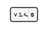
CSSA decimal number badge scrolls upward like a slot machine wheel to reveal the next increment.
- Tier
- CSS
- Dependencies
- None
- Duration
- 5.5 s, loops
- Categories
- Icons and micro-interactions
- Use cases
- Determinate progress, Success and confirmation
- Industries
- SaaS and software, Cross-industry
- Style
- Minimal line · light stroke
- Set
- changelog
- Tags
- counterloopminimaltextui
Companion assets
The same artwork, not animated. Derived from the entry’s own resting state, so it matches exactly.
Code
animation.svg
<svg xmlns="http://www.w3.org/2000/svg" fill="none" aria-hidden="true" class="pulsar pulsar-changelog-version-bump" data-pulsar="changelog-version-bump" viewBox="0 0 160 96"><g stroke="currentColor" stroke-linecap="round" stroke-linejoin="round" stroke-width="1.2"><rect width="88" height="44" x="36" y="26" fill="currentColor" fill-opacity=".04" rx="6"></rect><line x1="96" x2="96" y1="26" y2="70" opacity=".2"></line></g><g stroke="currentColor" stroke-linecap="round" stroke-linejoin="round" stroke-width="1.8"><polyline points="48,44 52,54 56,44"></polyline><path d="M64 45c0-2 5-2 5 1 0 4-5 8-5 8h6"></path><circle cx="74" cy="53" r="1" fill="currentColor"></circle><path d="m85 43-5 7h7v4"></path><circle cx="91" cy="53" r="1" fill="currentColor"></circle></g><g id="changelog-version-bump-wheel"><g id="changelog-version-bump-d0" stroke="currentColor" stroke-linecap="round" stroke-width="1.8"><rect width="8" height="10" x="104" y="44" rx="3"></rect></g><g id="changelog-version-bump-d1" stroke="var(--pulsar-accent, currentColor)" stroke-linecap="round" stroke-linejoin="round" stroke-width="1.8"><polyline points="105,46 108,44 108,54"></polyline><line x1="105" x2="111" y1="54" y2="54"></line></g></g><rect id="changelog-version-bump-glow" width="92" height="48" x="34" y="24" stroke="var(--pulsar-accent, currentColor)" stroke-width="1.5" opacity="0" rx="7"></rect></svg>
animation.css
.pulsar-changelog-version-bump #changelog-version-bump-d0 {
  animation: changelog-version-bump-scroll-0 5500ms cubic-bezier(0.4, 0, 0.2, 1) infinite;
}

@keyframes changelog-version-bump-scroll-0 {
  0%,
  30% {
    transform: translateY(0);
    opacity: 1;
  }
  42%,
  84% {
    transform: translateY(-24px);
    opacity: 0;
  }
  92%,
  100% {
    transform: translateY(0);
    opacity: 1;
  }
}

.pulsar-changelog-version-bump #changelog-version-bump-d1 {
  animation: changelog-version-bump-scroll-1 5500ms cubic-bezier(0.4, 0, 0.2, 1) infinite;
}

@keyframes changelog-version-bump-scroll-1 {
  0%,
  30% {
    transform: translateY(24px);
    opacity: 0;
  }
  42%,
  84% {
    transform: translateY(0);
    opacity: 1;
  }
  92%,
  100% {
    transform: translateY(24px);
    opacity: 0;
  }
}

.pulsar-changelog-version-bump #changelog-version-bump-glow {
  animation: changelog-version-bump-glow-anim 5500ms ease-out infinite;
}

@keyframes changelog-version-bump-glow-anim {
  0%,
  38% {
    opacity: 0;
    transform: scale(0.98);
  }
  44%,
  78% {
    opacity: 0.8;
    transform: scale(1.02);
  }
  86%,
  100% {
    opacity: 0;
    transform: scale(0.98);
  }
}

@media (prefers-reduced-motion: reduce) {
  .pulsar-changelog-version-bump * {
    animation: none !important;
  }
}