Ping
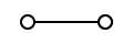
CSSA probe travels out to a node and returns, the round trip settling into a steady rhythm.
- Tier
- CSS
- Dependencies
- None
- Duration
- 4 s, loops
- Categories
- Loaders and spinners
- Use cases
- Loading and waiting
- Industries
- SaaS and software, Cross-industry
- Style
- Minimal line · light stroke
- Set
- signal
- Tags
- loopminimaluicirclepulse
Companion assets
The same artwork, not animated. Derived from the entry’s own resting state, so it matches exactly.
Code
animation.svg
<svg xmlns="http://www.w3.org/2000/svg" aria-labelledby="signal-ping-title" class="pulsar pulsar-signal-ping" data-pulsar="signal-ping" role="img" viewBox="0 0 120 40"><title id="signal-ping-title">Ping</title><circle id="signal-ping-node-a" cx="25" cy="20" r="6" fill="none" stroke="currentColor" stroke-width="2"></circle><circle id="signal-ping-node-b" cx="95" cy="20" r="6" fill="none" stroke="currentColor" stroke-width="2"></circle><line id="signal-ping-track" x1="31" x2="89" y1="20" y2="20" fill="none" stroke="currentColor" stroke-width="2" opacity=".2"></line><line id="signal-ping-probe-out" x1="31" x2="89" y1="20" y2="20" fill="none" stroke="var(--pulsar-accent, currentColor)" stroke-linecap="round" stroke-width="2" class="signal-ping-probe signal-ping-probe-out"></line><line id="signal-ping-probe-in" x1="89" x2="31" y1="20" y2="20" fill="none" stroke="var(--pulsar-accent, currentColor)" stroke-linecap="round" stroke-width="2" class="signal-ping-probe signal-ping-probe-in"></line><circle id="signal-ping-ripple-a" cx="25" cy="20" r="6" fill="none" stroke="currentColor" stroke-width="1.5" class="signal-ping-ripple signal-ping-ripple-a"></circle><circle id="signal-ping-ripple-b" cx="95" cy="20" r="6" fill="none" stroke="var(--pulsar-accent, currentColor)" stroke-width="1.5" class="signal-ping-ripple signal-ping-ripple-b"></circle></svg>
animation.css
/* Round trip: a probe sweeps out to node B, B rings, a probe sweeps back,
   A rings. The dash enters and leaves the track geometrically (offset 12 is
   before the start, -58 is past the end), so every opacity change happens
   while nothing is on the path and none of them is visible as a cut. */

.pulsar-signal-ping .signal-ping-probe {
  stroke-dasharray: 12 46;
  stroke-dashoffset: 12;
  opacity: 0;
  animation-duration: 4000ms;
  animation-iteration-count: infinite;
  animation-timing-function: cubic-bezier(0.37, 0, 0.63, 1); /* travel */
}

.pulsar-signal-ping .signal-ping-probe-out {
  animation-name: signal-ping-out;
}

.pulsar-signal-ping .signal-ping-probe-in {
  animation-name: signal-ping-in;
}

.pulsar-signal-ping .signal-ping-ripple {
  opacity: 0;
  transform-box: fill-box;
  /* fill-box makes the origin box-relative, so this must be a keyword or a
     percentage. A user-space length here lands outside the circle and throws
     the ripple off the node. */
  transform-origin: center;
  animation-duration: 4000ms;
  animation-iteration-count: infinite;
  animation-timing-function: cubic-bezier(0.22, 1, 0.36, 1); /* settle */
}

.pulsar-signal-ping .signal-ping-ripple-a {
  animation-name: signal-ping-ripple-a-anim;
}

.pulsar-signal-ping .signal-ping-ripple-b {
  animation-name: signal-ping-ripple-b-anim;
}

@keyframes signal-ping-out {
  0% {
    stroke-dashoffset: 12;
    opacity: 1;
  }
  34% {
    stroke-dashoffset: -58;
    opacity: 1;
  }
  34.5%,
  99.5% {
    stroke-dashoffset: -58;
    opacity: 0;
  }
  100% {
    stroke-dashoffset: 12;
    opacity: 0;
  }
}

@keyframes signal-ping-in {
  0%,
  49.5% {
    stroke-dashoffset: 12;
    opacity: 0;
  }
  50% {
    stroke-dashoffset: 12;
    opacity: 1;
  }
  84% {
    stroke-dashoffset: -58;
    opacity: 1;
  }
  84.5%,
  100% {
    stroke-dashoffset: -58;
    opacity: 0;
  }
}

@keyframes signal-ping-ripple-a-anim {
  0%,
  84% {
    transform: scale(1);
    opacity: 0;
  }
  88% {
    transform: scale(1.3);
    opacity: 0.85;
  }
  100% {
    transform: scale(2.4);
    opacity: 0;
  }
}

@keyframes signal-ping-ripple-b-anim {
  0%,
  34% {
    transform: scale(1);
    opacity: 0;
  }
  38% {
    transform: scale(1.3);
    opacity: 0.85;
  }
  52%,
  100% {
    transform: scale(2.4);
    opacity: 0;
  }
}

@media (prefers-reduced-motion: reduce) {
  .pulsar-signal-ping .signal-ping-probe,
  .pulsar-signal-ping .signal-ping-ripple {
    animation: none;
  }
  .pulsar-signal-ping .signal-ping-probe-out {
    opacity: 1;
    stroke-dashoffset: -17;
  }
  .pulsar-signal-ping .signal-ping-probe-in {
    opacity: 0;
  }
  .pulsar-signal-ping .signal-ping-ripple {
    opacity: 0;
    transform: none;
  }
}