Blueprint Compass
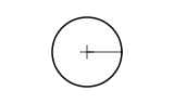
CSSA compass arm swings a full turn from the sheet centre, scribing a circle that reveals the marks inside it.
- Tier
- CSS
- Dependencies
- None
- Duration
- 1.2 s, plays once
- Categories
- Icons and micro-interactions, Transitions and reveals
- Use cases
- Loading and waiting, AI and processing
- Industries
- Professional services, Manufacturing and industrial
- Style
- Technical · hairline stroke
- Set
- blueprint
- Tags
- circlerotatestrokeone-shotgeometric
Companion assets
The same artwork, not animated. Derived from the entry’s own resting state, so it matches exactly.
Code
animation.svg
<svg xmlns="http://www.w3.org/2000/svg" aria-labelledby="blueprint-compass-title" class="pulsar pulsar-blueprint-compass" data-pulsar="blueprint-compass" role="img" viewBox="0 0 160 96"><title id="blueprint-compass-title">Blueprint compass</title><g id="blueprint-compass-sheet" fill="none" stroke="currentColor"><circle id="blueprint-compass-circle" cx="80" cy="48" r="32" stroke-linecap="square" stroke-width="1.5"></circle><g id="blueprint-compass-marks" stroke-linecap="square" stroke-width=".75"><path id="blueprint-compass-cross" d="M74 48h12m-6-6v12"></path><path id="blueprint-compass-rule" d="M80 48h32m0-2v4"></path></g><g id="blueprint-compass-arm"><rect id="blueprint-compass-arm-box" width="6" height="68" x="77" y="14" fill="none" stroke="none"></rect><circle id="blueprint-compass-pivot" cx="80" cy="48" r="3" stroke-width=".75"></circle><path id="blueprint-compass-shaft" stroke-linecap="square" stroke-width="1.5" d="M80 48V16"></path><circle id="blueprint-compass-tip" cx="80" cy="16" r="2" fill="currentColor" stroke="none"></circle></g></g></svg>
animation.css
.pulsar-blueprint-compass #blueprint-compass-circle {
  stroke: var(--pulsar-accent, currentColor);
  stroke-dasharray: 201.06;
  transform-box: fill-box;
  transform-origin: 50% 50%;
  animation-name: blueprint-compass-scribe;
  animation-duration: 1200ms;
  animation-delay: 0ms;
  animation-timing-function: linear;
  animation-iteration-count: 1;
  animation-fill-mode: both;
}

.pulsar-blueprint-compass #blueprint-compass-arm {
  transform-box: fill-box;
  transform-origin: 50% 50%;
  animation-name: blueprint-compass-swing;
  animation-duration: 1200ms;
  animation-delay: 0ms;
  animation-timing-function: linear;
  animation-iteration-count: 1;
  animation-fill-mode: both;
}

.pulsar-blueprint-compass #blueprint-compass-marks {
  animation-name: blueprint-compass-marks-in;
  animation-duration: 1200ms;
  animation-delay: 0ms;
  animation-timing-function: linear;
  animation-iteration-count: 1;
  animation-fill-mode: both;
}

@keyframes blueprint-compass-scribe {
  0% {
    transform: rotate(-90deg);
    stroke-dashoffset: 201.06;
    animation-timing-function: linear;
  }
  83.333% {
    transform: rotate(-90deg);
    stroke-dashoffset: 0;
  }
  100% {
    transform: rotate(-90deg);
    stroke-dashoffset: 0;
  }
}

@keyframes blueprint-compass-swing {
  0% {
    transform: rotate(0deg);
    opacity: 1;
    animation-timing-function: linear;
  }
  83.333% {
    transform: rotate(360deg);
    opacity: 1;
    animation-timing-function: cubic-bezier(0.4, 0, 0.2, 1);
  }
  100% {
    transform: rotate(360deg);
    opacity: 0;
  }
}

@keyframes blueprint-compass-marks-in {
  0% {
    opacity: 0;
    animation-timing-function: linear;
  }
  83.333% {
    opacity: 0;
    animation-timing-function: cubic-bezier(0.4, 0, 0.2, 1);
  }
  100% {
    opacity: 1;
  }
}

@media (prefers-reduced-motion: reduce) {
  .pulsar-blueprint-compass #blueprint-compass-circle {
    animation: none;
    transform: rotate(-90deg);
    stroke-dashoffset: 0;
  }

  .pulsar-blueprint-compass #blueprint-compass-arm {
    animation: none;
    transform: none;
    opacity: 0;
  }

  .pulsar-blueprint-compass #blueprint-compass-marks {
    animation: none;
    opacity: 1;
  }
}