Generate
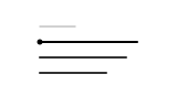
CSSThree dashed text blocks draw in sequentially from left to right along a horizontal axis, fading out simultaneously before restarting the loop.
- Tier
- CSS
- Dependencies
- None
- Duration
- 4 s, loops
- Categories
- Loaders and spinners
- Use cases
- Loading and waiting, AI and processing
- Industries
- SaaS and software, Legal
- Style
- Minimal line · light stroke
- Set
- clause
- Tags
- barsstrokestaggerloop
Companion assets
The same artwork, not animated. Derived from the entry’s own resting state, so it matches exactly.
Code
animation.svg
<svg xmlns="http://www.w3.org/2000/svg" fill="none" aria-hidden="true" class="pulsar pulsar-clause-generate" data-pulsar="clause-generate" viewBox="0 0 160 96"><g stroke="currentColor" stroke-width="1.25" class="draft-header" opacity=".3"><line x1="36" x2="68" y1="24" y2="24" stroke-linecap="round"></line></g><g class="clause-blocks"><line x1="36" x2="124" y1="38" y2="38" stroke="var(--pulsar-accent, currentColor)" stroke-dasharray="88" stroke-dashoffset="88" stroke-linecap="round" stroke-width="2" class="block b1"></line><line x1="36" x2="114" y1="52" y2="52" stroke="currentColor" stroke-dasharray="78" stroke-dashoffset="78" stroke-linecap="round" stroke-width="2" class="block b2"></line><line x1="36" x2="96" y1="66" y2="66" stroke="currentColor" stroke-dasharray="60" stroke-dashoffset="60" stroke-linecap="round" stroke-width="2" class="block b3"></line></g><circle cx="36" cy="38" r="2.5" fill="var(--pulsar-accent, currentColor)" class="cursor"></circle></svg>
animation.css
.pulsar-clause-generate {
  display: block;
  width: 100%;
  height: 100%;
}
.pulsar-clause-generate .block.b1 {
  animation: clause-generate-draw-1 4s ease-out infinite 0s;
}
.pulsar-clause-generate .block.b2 {
  animation: clause-generate-draw-2 4s ease-out infinite 0s;
}
.pulsar-clause-generate .block.b3 {
  animation: clause-generate-draw-3 4s ease-out infinite 0s;
}
.pulsar-clause-generate .cursor {
  animation: clause-generate-cursor 4s ease-in-out infinite 0s;
}
@keyframes clause-generate-draw-1 {
  0% {
    stroke-dashoffset: 88;
    opacity: 0;
  }
  15% {
    opacity: 1;
  }
  30%,
  80% {
    stroke-dashoffset: 0;
    opacity: 1;
  }
  95%,
  100% {
    opacity: 0;
    stroke-dashoffset: 0;
  }
}
@keyframes clause-generate-draw-2 {
  0%,
  25% {
    stroke-dashoffset: 78;
    opacity: 0;
  }
  35% {
    opacity: 1;
  }
  50%,
  80% {
    stroke-dashoffset: 0;
    opacity: 1;
  }
  95%,
  100% {
    opacity: 0;
    stroke-dashoffset: 0;
  }
}
@keyframes clause-generate-draw-3 {
  0%,
  45% {
    stroke-dashoffset: 60;
    opacity: 0;
  }
  55% {
    opacity: 1;
  }
  70%,
  80% {
    stroke-dashoffset: 0;
    opacity: 1;
  }
  95%,
  100% {
    opacity: 0;
    stroke-dashoffset: 0;
  }
}
@keyframes clause-generate-cursor {
  0% {
    transform: translate(0, 0);
    opacity: 0;
  }
  10%,
  25% {
    transform: translate(88px, 0);
    opacity: 1;
  }
  30% {
    transform: translate(0, 14px);
    opacity: 0;
  }
  35%,
  50% {
    transform: translate(78px, 14px);
    opacity: 1;
  }
  55% {
    transform: translate(0, 28px);
    opacity: 0;
  }
  60%,
  75% {
    transform: translate(60px, 28px);
    opacity: 1;
  }
  80%,
  100% {
    opacity: 0;
  }
}
@media (prefers-reduced-motion: reduce) {
  .pulsar-clause-generate .block.b1,
  .pulsar-clause-generate .block.b2,
  .pulsar-clause-generate .block.b3,
  .pulsar-clause-generate .cursor {
    animation: none;
    transform: none;
    stroke-dashoffset: 0;
    opacity: 0.8;
  }
}