Verify
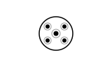
CSSAn asymmetric pattern of dots rotates and meshes perfectly with a static mesh of guide circles, locking into place with a subtle flash.
- Tier
- CSS
- Dependencies
- None
- Duration
- 4 s, loops
- Categories
- Data and progress
- Use cases
- Success and confirmation, Security and trust
- Industries
- Security and identity, Cross-industry
- Style
- Technical · light stroke
- Set
- credential
- Tags
- dotscirclegeometricminimalglow
Companion assets
The same artwork, not animated. Derived from the entry’s own resting state, so it matches exactly.
Code
animation.svg
<svg xmlns="http://www.w3.org/2000/svg" fill="none" aria-hidden="true" class="pulsar pulsar-credential-verify" data-pulsar="credential-verify" viewBox="0 0 160 96"><g stroke="currentColor" stroke-width="1.2" opacity=".35"><circle cx="68" cy="38" r="5"></circle><circle cx="92" cy="38" r="5"></circle><circle cx="68" cy="58" r="5"></circle><circle cx="92" cy="58" r="5"></circle><circle cx="80" cy="48" r="6"></circle></g><g class="credential-verify-constellation"><circle cx="68" cy="38" r="3" fill="var(--pulsar-accent, currentColor)"></circle><circle cx="92" cy="38" r="3" fill="var(--pulsar-accent, currentColor)"></circle><circle cx="68" cy="58" r="3" fill="var(--pulsar-accent, currentColor)"></circle><circle cx="92" cy="58" r="3" fill="var(--pulsar-accent, currentColor)"></circle><circle cx="80" cy="48" r="3.5" fill="var(--pulsar-accent, currentColor)"></circle></g><circle cx="80" cy="48" r="24" stroke="var(--pulsar-accent, currentColor)" stroke-width="1.5" class="credential-verify-flash"></circle></svg>
animation.css
.pulsar-credential-verify {
  display: block;
  overflow: visible;
}
.pulsar-credential-verify .credential-verify-constellation {
  transform-origin: 80px 48px;
  animation: credential-verify-constellation-anim 4000ms cubic-bezier(0.2, 1, 0.3, 1) infinite;
}
.pulsar-credential-verify .credential-verify-flash {
  transform-origin: 80px 48px;
  animation: credential-verify-flash-anim 4000ms ease infinite;
}

@keyframes credential-verify-constellation-anim {
  0% {
    transform: rotate(45deg) scale(0.85);
    opacity: 0.5;
  }
  38%,
  80% {
    transform: rotate(0deg) scale(1);
    opacity: 1;
  }
  92%,
  100% {
    transform: rotate(45deg) scale(0.85);
    opacity: 0.5;
  }
}

@keyframes credential-verify-flash-anim {
  0%,
  36% {
    transform: scale(0.6);
    opacity: 0;
  }
  44% {
    opacity: 0.9;
  }
  65% {
    transform: scale(1.4);
    opacity: 0;
  }
  100% {
    transform: scale(1.4);
    opacity: 0;
  }
}

@media (prefers-reduced-motion: reduce) {
  .pulsar-credential-verify * {
    animation: none !important;
  }
}